Tips and tricks to enrich digital data stories, from embedded maps to juxtapose visualisations, videos and more.
GeoNode – embedded map
Embed a map from UTU Geospatial data service (or from any other GeoNode-based platform). This can be done with the custom HTML block in WordPress. Copy-and-paste the URL of your published map in UTU Geospatial data service to the code. Modify the border, height and width by changing the parameters, if needed.
<iframe
  style="border: none;" height="600" width="600"
  src="URL TO YOUR MAP/embed">
</iframe>
Complete tutorial can be found from GeoNode documentation.
Juxtapose
Create a Juxtapose for comparing images from the same area with this KnightLab’s service: https://juxtapose.knightlab.com/#make. Use Dropbox or URL addresses to published images when selecting the images. The images used in this example are published by uploading them to this WordPress blog. WordPress generates an URL for each uploaded image. You can find the URL in the media library.
Publish the Juxtapose and add the generated embed-code to custom HTML block here in WordPress. The embed-code for this example looks like this:
<iframe frameborder="0" class="juxtapose" width="100%" height="400" src="https://cdn.knightlab.com/libs/juxtapose/latest/embed/index.html?uid=1053ff64-3aec-11ec-abb7-b9a7ff2ee17c"></iframe>And the final product:
Datawrapper – maps and graphs
The Internet is full of map and infrograph tools. One easy-to-use, free and visually sound example is Dutch website Datawrapper. You can create charts, tables and maps from your datasets and publish and embed them to WordPress – either in static or in interactive format.
Once again, the embedding for published product happens via the Custom HTML block in WordPress. HTML code is generated by Datawrapper when the chart or map is published. Parts of the code can be modified to ensure successful layout in WordPress, e.g. changing the minimum width of the graph from 100% to 40%.
The embed-code for this example chart looks like this:
<iframe title="Example: Global CO2 emissions" aria-label="Interactive area chart" id="datawrapper-chart-2JWm9" src="https://datawrapper.dwcdn.net/2JWm9/1/" scrolling="no" frameborder="0" style="width: 0; min-width: 40% !important; border: none;" height="600"></iframe><script type="text/javascript">!function(){"use strict";window.addEventListener("message",(function(e){if(void 0!==e.data["datawrapper-height"]){var t=document.querySelectorAll("iframe");for(var a in e.data["datawrapper-height"])for(var r=0;r<t.length;r++){if(t[r].contentWindow===e.source)t[r].style.height=e.data["datawrapper-height"][a]+"px"}}}))}();
</script>
Which then generates this output:
Map visualisation created in Datawrapper:
Media - images, videos and audio

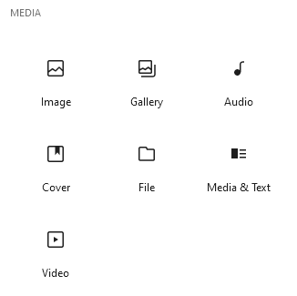
WordPress supports a great variety of media products. They can easily be added from WordPress' building blocks. Block Media & Text was used to create this layout.
Videos can be added by uploading a video to WordPress media library and displaying it using the Video block, or by providing an URL address to videos published e.g. in YouTube, Vimeo, VideoPress or TikTok.
Video below is embedded using the WordPress' YouTube block.
Other tools
Infographics - Canva and Piktochart
Story maps - ArcGIS StoryMaps and KnightLab StoryMap
Temporal animations - QGIS Temporal Controller (demo by GISPO)

